Tuesday, February 26, 2013

Sophie Knee Exhibition

Here's the invitation that showed up in my mailbox two weeks ago.
Don't miss this opportunity to view
'PATTERN'
the 2013 Solo Exhibition of
Sophie J. Knee!!!

March 1 - 31, 201
Opening Reception:March 1, 6:oo PM - 9:00 PM

Sharon Weiss Gallery
20 Lincoln Street
in the Short North of Columbus, OH

Three of Sophie's monoprints grace the walls of my home:
a black and white bunny, two fish, and a large heron.
This English born artist has the ability to capture the essence of animals in a sublimely subtle but powerful way. Her working method, thought seemingly simple, is really well thought out and complex. She works for hours on one surface to get one print. Ms. Knee is master of her craft, and of the use of line and shape.

Monday, February 25, 2013

Just Sold!

"Late Summer Urn" • 8" x 6"
Oil on RayMar Featherweight Panel with Smooth Canvas
Here's an alla prima painting I did last September in Oglebay, WV. I taught a plein air workshop during their annual plein air event, and the next day enjoyed meeting many new artists, and painting alongside a few of my students. It was a glorious day, and I was surrounded by an early autumn landscape of rolling terrain, but this was the subject that was talking to me. I liked the movement in the plants and the strong light and shadow, and of course the reds. I used one brush and my favorite palette knife to mix and apply my usual prismatic palette.

The support for this painting is a RayMar panel. RayMar is a great company, but I don't often get my best paintings on their panels. So why do I keep buying them? Usually it becomes an issue of time management, but there is a certain stubbornness on my part to learn how to paint on their surfaces. This sounds a bit crazy, I know.

A couple years ago, RayMar started making their 'featherweight panels'. This surface is their 'smooth cotton'. But this smooth cotton feels smoother to my palette knife than the same smooth cotton on the regular weight panel. These featherweights are great for traveling: 2 regular weight panels = the thickness of 4 featherweight panels! More panels take up less space!!! You gotta love that.

I enjoyed chatting with the public while I worked on this painting, but not as much as I enjoyed  my conversation with a gentleman from Texas as we figured out how to get this painting to his lovely lady as a surprise Valentine's Day gift!

Thursday, February 21, 2013

Robert 1 & 2: Part 2


Robert #2 • 7-1/2 x 7-1/2" • Oil on 8-ply Museum Board
Here is a surface that I love: transparent to opaque, and with several passages of thick juicy paint.

The Robert photos were taken with a Motorola Xybord tablet. I deleted my discussion of how this photo differs from the actual painting.

Here's Robert 1 again, for comparison.
Quite a style change!
Robert 1, a more realistic approach. I liked him, but thought, "I could do this realistic thing each week and get better and better at it, but why not use these sessions to be more experimental and poetic?" I would also push myself farther by playing with color, and change from brushes to a palette knife.

   Less is More: 
    • 2 colors: Utrech Raw Sienna & Holbein Compose Blue
                     Utrecht Titanium white & possibly a Gamblin grey
    • Surface: acrylic primed 8-ply Museum Board
    • Tool: Loew-Cornell J-2 palette knife
I didn't want anything to get in the way of
my improvisation.

Approach to Robert 1: more traditional - start with tone and line - move on to masses - refine each mass as the painting progresses. Goal: a quality of light and form.

Approach to Robert 2: careful observation of shapes and values - paint applied in a lively and interesting way - Goal: explore how far I could push two colors and white, make a poetic statement with an interesting painting surface.

Problems: The 2 colors were chosen quickly, just minutes before I left my studio. I thought 'temperature' but didn't consider value. At some point in the painting process, the light bulb went on, and I said to myself, "These two colors have limited your ability to get a dark dark." Remember, color has value! I was frustrated at the very end of the painting without a slightly darker accent. I will reveal the secret of the darkest darks later.

 Compose blue  is a color I purchased from Carl Dalio's workshop supply list. It suffices as a poor man's Cerulean blue, with a rather weak tinting strength. Mix it with  Raw Sienna , and you do get a greenish blue - sort of an aqua, but not quite.

I pre-mixed these two colors full strength in varying ratios to see how they affected each other. I decided go with the coolest result for the overall shadow area of the head. No tone this time, I had no OMS with me. No placement lines or outlines this time, I was using only my palette knife. I had to use my mind's eye, drawing skills, and experience for the placement. I believe I started in what would be the cheek area, and worked outward by applying a thin layer of paint that continued to grow into a shape that resembled Robert's head.

It was rather exciting to see how easy this was!
And fun. Fun is important, so I've been told.
I know that I've been reading a lot of history lately, and studying French,
but I can just see this guy as someone that could have gone to the guillotine.
Must be the regal nose!
On the model's break, I mixed more nuances of tones and value, pushing the notes toward blue or the green, or sienna, adding white, working for as much variety as I could get from these two particular colors and white.

What's in a surface? By now you know that I love a varied surface almost more than life itself! You can see that I scratched through the translucent paint surface, and then smoothed some of lines back out. I worked and reworked until I got the look I wanted. And of course, the thinner layers are contrasted with some passages of thicker paint. Variety, the spice of life, and for me, the life of a painting.

The value of overpainting an area: If you overpaint a shape slightly, don't panic, you now have the wonderful opportunity to correct your shapes by painting negatively. You can get some wonderful effects and interesting edges with negative painting. Sometimes will might pull some of the positive colors the negative area. Don't panic, this can work for you. Let it live there a while while you ponder it as part of the whole. Experience in painting will tell you if this is a good thing for that painting. I know that Kevin Macphersen had this happen in a demo and told his audience, "Leave it!" Sometimes a 'preceived mistake' is a blessing in disguise, but it takes experience to sort this out.
You must be willing to take a risk if you are to move forward in your work.

"After all," says Ken Auster,
"What are you afraid of, one more bad painting?"
I love a surface with paint from transparent to opaque, thin to thick.
Challenge: getting the above the ear the right tone and value. In the photo the hair appears dark and brown, but in the painting it's really a softer warm gray. Risk: If I apply the wrong tone mixed with white, I will never be able to get back my transparent or translucent surface and have it look the same. Fun: Along the edge of his nose I used some pure raw sienna near the highlight, as that actually appeared red to me on the model.

I was not happy with the chest, however, the light on the chest had many subtle twists and turns, and I was using my magnetic easel which pulls on the metal of the palette knife. But no matter, I love this little effort because it is more about the process of painting a poetic statement. There is  more of a sense of light in the painting than in the photos, and to my eye, there is more poetry here.

 Hint: Need a dark? Visit your neighbor's palette while they're on break and dip into the thalo green, no less. Lucky for me, that green was almost dry, and I had to work hard just to get even a smidge. Still, it doesn't take much to get the value shift that I wanted for a very few dark darks in the eye socket. And of course, it does help if you know your neighbor.  

Wednesday, February 20, 2013

Robert 1 & II: Part 1

Robert #1 • 10-1/2" x 8" • Oil on unstretched canvas
My Monday evenings have improved with the addition of an evening session of model painting. This was the first week's painting. The model's name is, of course, Robert, and as it happens, I knew him. Last year, I took a figure drawing class at a church in Gahanna with a wonderful artist and teacher named Dennis Drummond. Some of you may have studied with him at CCAD; I never did. But, we had Robert as one of our models. I liked him then, and and my opinion hasn't changed since then.

I like is his face, strong and interesting, with a nice cleft chin. He looks a bit rougher in person, but if you work on him, you can get him to smile a little. And, just in case this is important to you, he passes out dark chocolate to the artists on his breaks.
He looks different without all that blue tape.
It had been a very long time since I'd worked from a model, and it took me a while to settle into this painting. Working on one of my favorite surfaces, an unstretched canvas taped to a gatorboard, I began with a tone of transparent oxide red, thinned down with OMS and wiped to a light value. You can get a similar peachy tone with Burnt Sienna, which it is also nice for landscape painting. Next, I added some lines, and when I was satisfied with the placement and a loose drawing, I started with the darks and shadows.
I think he looks pretty good as a square.
The darks weren't as dark as I'd have liked in reality, but I scrubbed in a semi-transparent tone wherever I saw shadow. Later I applied actual color over that. On the light side of the face, there are several places where the toned canvas shows through the paint and animates the surface.

The room itself has two sources of artificial light, plus curtains over windows for a third source, and then there is a spotlight on the model, which surprisingly does give a strong enough light and shadow - especially if you remember to squint. But, as the evening progresses, the light changes quite a bit in the room.

A friend had warned me that on one side of the room, the light was yellow. I didn't notice it. I use a clip-on Mighty Brite light that I purchased for $14.00 at my local Barnes and Noble. All the colors I normally use were on my palette: cad lemon yellow, cad light, cad red light, quinacridone red, ultramarine lbue and thalo blue; but, I used grays instead of the blues, and no quinacridone or lemon yellow. I decided to try an 'alien color', something I'd received as a sample at last year's Plein Air Convention or in the Adirondacks, not sure which. It was made by Williamsburg and called Alizarine Orange: very transparent, with a high tinting power.

At the end of the evening, I wasn't totally dissatisfied with my painting. The thing that bothered me most was that I didn't get Robert's chin correct. I love a man with a Cary Grant chin, but Robert's is stronger than what I have captured. Still, I decided that it wasn't bad for the length of time that I'd been away from painting a face from life.
Detail of Robert's ear and pony tail. Look at how cool that little spot of gray is in a sea of warm color!
 At the end of the night, one of the artist's grabbed my painting out of my hand to study it. His comment, "Interesting that you used yellow for his skin." I suppose that it could look like jaundice, but there appeared to be a lot of yellow in his skin. I offered him the remains of the Alizarin Orange. He refused it three times before taking it. I have to remember to ask him if he's tried it. There certainly wasn't much in the sample to start.

 Hint: if an artist offers you free paint, take it! See what you can do with it. 

Saturday, February 16, 2013

Richard III and an Apology

Richard III's skull
Skull of Richard III
I offer you an apology. My last post, poorly written and filled with errors, was published by accident before I was finished writing and editing. Click here for a link to more photos of his skeleton.

The earliest surviving portrait of Richard III in Leicester Cathedral
Portrait of Richard III
There are so many things stimulating and exciting my brain right now: all of the images that are painted in words in "The Great Upheaval", the meteor that hit Russia, my husband who is just home from a month in Chile and four earthquakes, the book Van Gogh in Arles that I am reading, French lessons, exercise, model session, and now a bad knee gone worse - since yesterday's training session. I plan on calming down tonight, with a glass of wine at a soirée at the home of one of the members of the Alliance Française de Columbus.

I know that you like photos, and since most of your are artists, I just had to post Richard's skull. Most of you are artists, right? Can't go wrong with a skull, it's anatomy. And a painting of the king so you can try and compare the skull to the artist's portrayal of the man. Next time, two paintings I did at the Monday night model session.

Thursday, February 14, 2013

So much interesting stuff going on in the USA, right? Gun-control discussions, the "live on TV" man-hunt in California, too much politics. Whew! I'm tired of all that.

Still, I have started listening to a book on tape (29 CD's no less) called "The Great Upheaval: A History of the Modern World from 1788 - 1800. I found it at the library two days ago, and I just can't stop listening to it.

The author writes a lively account of the world from 1788 - 1800, mainly focusing on and contrasting the societies of France, Russia and the newly formed United States, but also Western Europe and some of the Islamic World. The introduction says that you really can't understand the changes that spurred the growth of the modern world without knowing the context in which the seeds of the modern world were sown.

He weaves a seamless tapestry of the life and times and how decisions and actions in each country effected not only the country and its people but had far reaching circumstanceweek for the others. The lively and intersting style of writing is brought to life by a wonderful reader. I just can't image reading 26 CD's worth of text outloud.

Acutally, I can. I read to my children everyday and evening, and continued reading to my grandchildren, and also in Ohio schools with kids for about two years.

And then there was the culmination of the largest man-hunt in LAPD history, live on CNN. Go figure. The gunman wanted to go out in a blaze of glory, and he did, sadly taking yet one more officer with him before either killing himself or burning to death in his hideout cabin in California.

I feel that at each press conference the questions get more and more rediculous as 24 hour news downgrades news into entertainment. I was pleased to see an X-Navy SEAL say that unless you were there at the time, you have no right to question how things were done.

Gun control, I would like to see it happen, because when those that are paranoid with large arsenals decide to storm the US government, I don't want to be around for that.

But, I have to say that most intersting thing that I have heard in a long time was the story of the discovery of the skeleton on Richard III in Leister, England car park! Now really, how cool is that? I first heard it on NPR.

http://www.bbc.co.uk/news/uk-england-leicestershire-21063882

Wednesday, February 06, 2013

"Do I look like a man with a plan?" asked the Joker


Painting my winner at the first 'Art at the Arnold Competition'
Photo courtesy of Zak Tuggle.
I've been thinking a lot lately about 'conceptual art'. In the schools I attended, I missed out - or not - on classes where conceptual art was king. I did study it as part of a History of Modern Art class, but was never asked to participate in making it. Well, not until I studied printmaking with Debra Fisher at Denison University in Granville, OH.

I was the only person at that school that really seemed to be able to draw well. Not a bad thing in my book, but it didn't help me one bit in trying to get at the heart of conceptual art. All of the pieces were too literal. Really, I didn't, and still don't get it, in terms of how to even approach it - not that I am trying to beyond having 'a concept', and 'idea' in each painting.

What am I talking about in each painting? I was warned by my landscape instructor at CCAD against making paintings that people wanted to hang over their sofa, and I never chose a subject just because I think it will sell. But, I do think with the start of each painting, what am I trying to say?

Still, conceptual art seems to keep coming up in conversations lately. And I would like to understand it. So, I Googled 'conceptual art'.

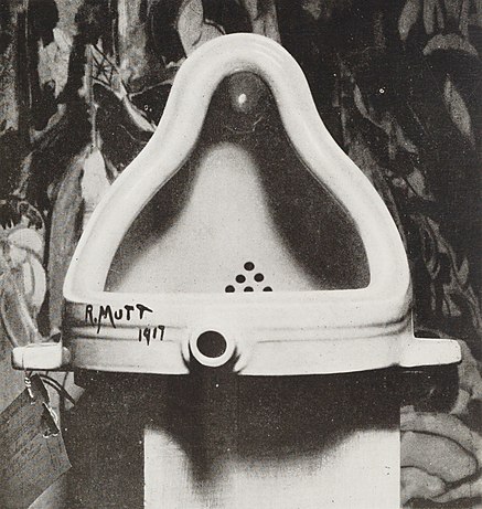
The first thing that came up was Wikipedia, of course; the first photo was of "Fountain" by Marcel Duchamp, and I was reminded how much I love his work.

File:Duchamp Fountaine.jpg
Marcel Duchamp, Fountain, 1917. Photograph by Alfred Steiglitz
"The French artist Marcel Duchamp paved the way for the conceptualists, providing them with examples of prototypically conceptual works — the readymades, for instance. The most famous of Duchamp's readymades was Fountain (1917), a standard urinal basin signed by the artist with the pseudonym "R.Mutt", and submitted for inclusion in the annual, un-juried exhibition of the Society of Independent Artists in New York (it was rejected).[8] In traditional terms, a commonplace object such as a urinal cannot be said to be art because it is not made by an artist or with any intention of being art, nor is it unique or hand-crafted. Duchamp's relevance and theoretical importance for future "conceptualists" was later acknowledged by US artist Joseph Kosuth in his 1969 essay, "Art after Philosophy," when he wrote: "All art (after Duchamp) is conceptual (in nature) because art only exists conceptually."

I thought I'd also post this conceptual piece, which I love probably because I've felt the power of fabric hanging in the landscape in Bhutan. How beautiful and impressive this must have been in it's short lifetime.

Valley Curtain

Valley Curtain 1972 (USA)
"At the end of 1970 Christo and Jeanne-Claude began the preparations for the Valley Curtain project. A 400-meter long cloth was to be stretched across Rifle Gap, a valley in the Rocky Mountains near Rifle, Colorado. The project required 14,000 m2 of cloth to be hung on four steel cables, fastened with iron bars fixed in concrete on each slope, and 200 tons of concrete. The budget increased to $400,000 causing Christo and Jeanne-Claude additional problems with the financing. Finally enough works of art were sold to raise the money and, on 10 October 1971, the orange-coloured curtain was ready for hanging, but was torn to shreds by wind and rock. While a second curtain was being manufactured, Christo received a message from a Berlin art historian to wrap the Reichstag in response to the 1961 "Project for Wrapping a Public Building". On 10 August 1972 the second attempt to hang the cloth succeeded, but only 28 hours later it was destroyed by a storm gale in excess of 60 miles per hour.
The project was shown in the documentary film, Christo's Valley Curtain by David and Albert Maysles, which was nominated for an Academy Award for Best Documentary Short."


And I am reminded now of the power of Sid Chafetz's powerful exhibition "The Perpetrators", lithographs portraits of infamous and powerful Nazis, along with an installation simulating a walk into a Nazi death chamber. I met Sid, once or twice, and know at least one of his students, Edie Dean. Sid passed away last month, but he lives on in his students and in his art. Now that is a concept I like!

I am wondering how many of you look at conceptual art, understand it, can give your insight or experience about it or with it.

Sargent Watercolors


I've been missing in action, so I may as well get my late start to the new year by posting something masterly! Here is the link to the upcoming Sargent Watercolors Exhibition.